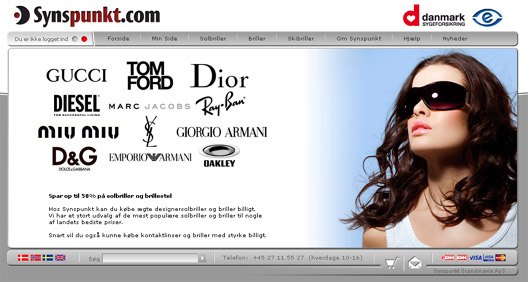
Giant updates almost done on Contact Lenses – Glasses website
Last 2 months I have been highly dedicated to update a Danish webshop I build from scratch.
Synspunkt is more or less ready to sell Contact Lenses (In Danish Kontaktlinser) & Glasses on the Danish market and I am very close to being done with all the functions and workflow.

The special thing about their product line is the millions of variants that they want to offer their clients. It’s so specialised there are no “off the shelf” software to do this or to get inspiration from, so had to dig deep into my own skills to get this done. And I’m extremely pleased I cracked the nut(s)
We also updated the design so it fits the new market they are aiming at. They are the most popular webshop in Denmark when it comes to Sunglasses and now we are about ready to conquer the Contact Lenses & Glasses market as well.
We expect to reveal the new product lines in february 2008.
Technologies used: ASP/VB, AJAX, XML, JavaScript

That is really a great looking shop Claus. Only thing that annoys me is that I don’t see any pictures when I click on the brand name. I hate having to click twice (on the actual product ID – (which I thing you should change to a meaningful name instead)). But other than that it looks really cool.
Hi Mikael, yeah I can agree with you that the product names isnt the best idea, but it is actually what people search for to get the right sunglasses. So we need to take that up with the producers of the brands 🙂
About the pictures, we added a picture preview of the brands “Oversigt” you can find in the left colum bottom. Like this
But I appreciate your thoughts and will talk to the owners about it.
Looking pretty nice, its a nice to see a simple and yet inviting site.
Design vise I only have one thing I would have liked to see different, the dropdowns could have a little eye-candy, since the rest of the site looks pretty sleek.
The coding leaves a few things to be desired, considered going DIV for better overall structure and future changes?
But other than that, really nice work!
Thanks, yeah must be lack of my skills on the css part on the dropdowns 🙂 I’v tried hundreds of combinations and keep ending up with the plain one heh.
And the div part is very true, but I’m just so used to building in tables its hard for me to change design style.
Think I will look for some course or good tutorials to learn css properly, as it is my achilles heal 😀
Ok, I gave the menues a turnover and made them graphical now.
Should look a little better 🙂